17 Aug 2024
rest.quest: An opinionated to-do list
A project report
After building Fieldnotes, I was hooked on side projects. It was a ton of fun to build something that would end up actually being useful every day. However, the scope creep that overwhelmed me with Fieldnotes made me a bit wary of just repeating the same thing. Instead, I set myself up for a much more structured journey this time. You can read a synopsis of this here. But in this note, I’ll showcase rest.quest specifically, outline in more detail the design process and elaborate on the learnings.
Motivation
I’m a forgetful person. For a long time, I would just surrender to that fact and, you know, forget stuff all the time. At some point, I decided to take matters into my own hands and start using to-do lists seriously. With Todoist as my application of choice, I quickly realized how much better it feels to not just let random thoughts fall through the cracks. As the initial excitement tapered off, however, I started slipping into old habits.
I identified the sluggishness and friction in Todoist as a hurdle keeping me from using my to-do list consistently. So when I was looking for a quick project to try my 16-hour concept, a to-do list replacement special-tailored to my needs jumped out at me.
Features
rest.quest is a tiny, opinionated to-do list. There is no backend component; hence there is also no sign-up. It primarily stores data in the browser. The user can optionally provide credentials for an S3-compatible object storage bucket to synchronize the state directly from the browser to the bucket.
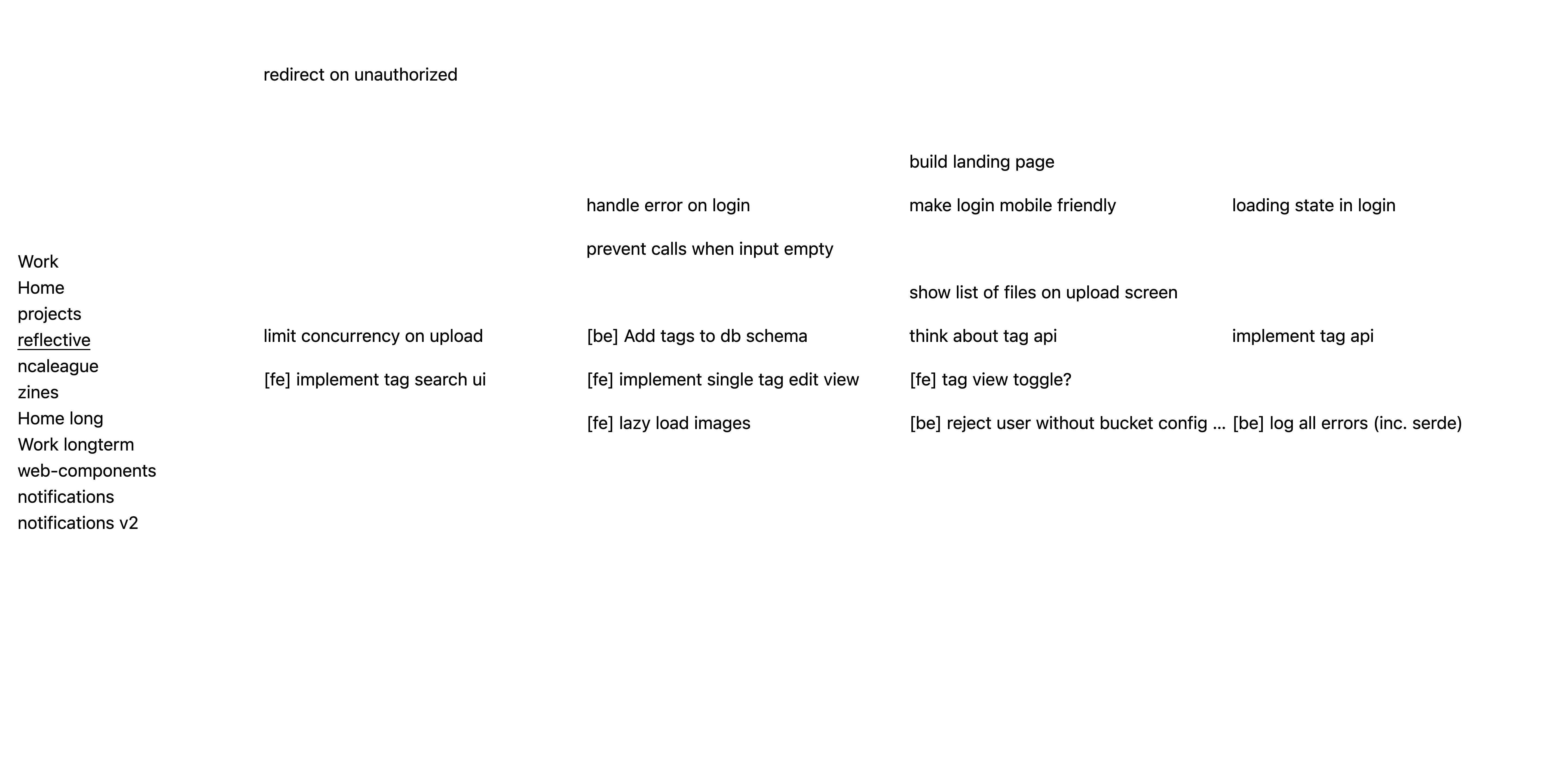
On the left, vertically centered, is a list of projects. All the to-do items (or quests, if you will) in the selected project are laid out in a 2D grid, taking up the rest of the screen. Already, you can gauge the vibe of this application: It’s downright brutalist in design. There is no distraction in sight. Only relevant information.
The application is highly keyboard-driven. By hitting n on the keyboard, a new text input field appears in the next available spot at the end of the list. Checking off an item is a matter of clicking on the text of the item itself. An item’s description can be edited by clicking on the Edit button that appears next to it on hover.
When items are checked off, they leave a gap to visualize the progress you’ve made in working through your list.
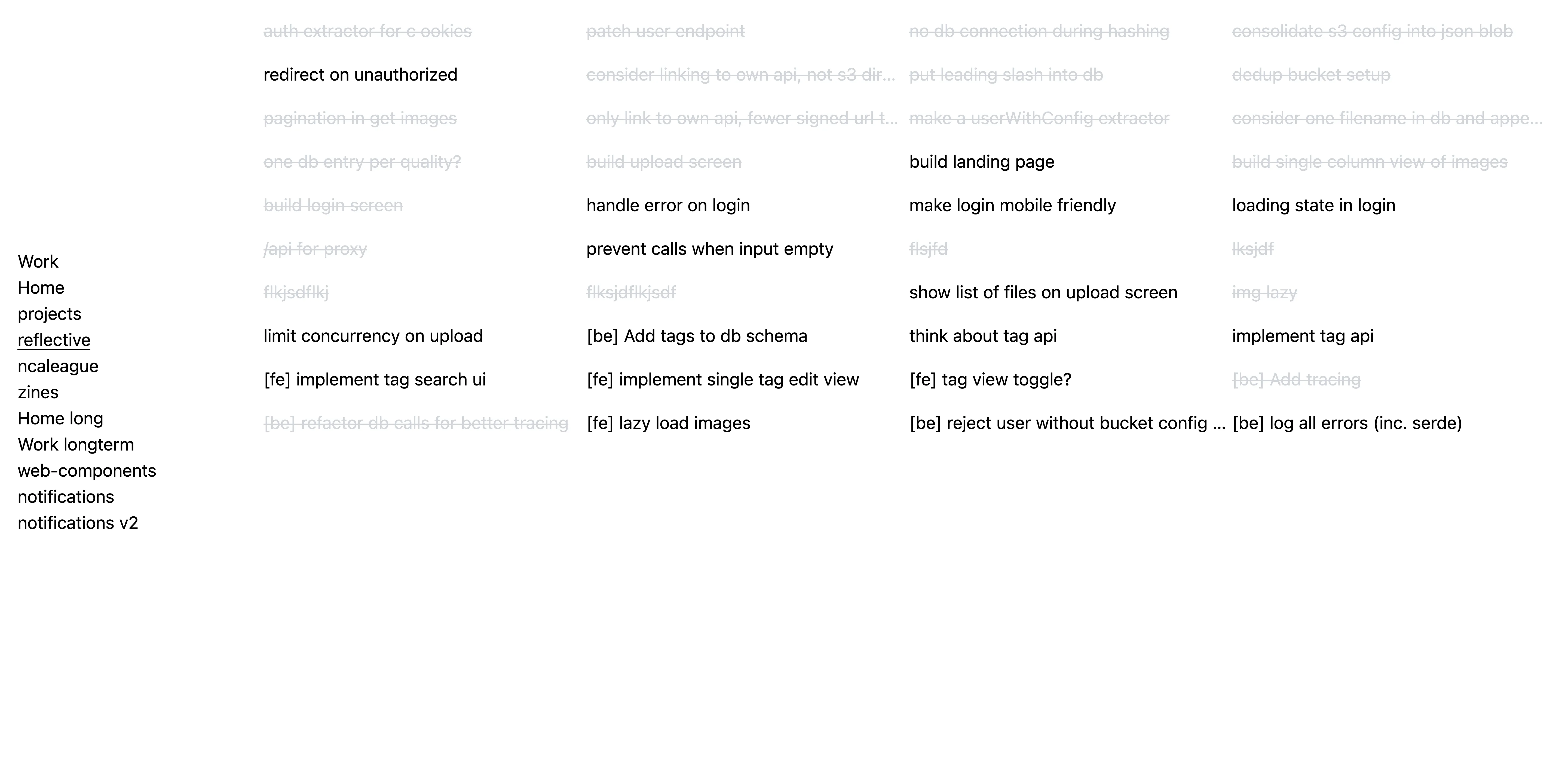
The quest view can be switched between the default with gaps, one where the checked-off items are shown as strikethrough, or one that doesn’t show the old items at all.
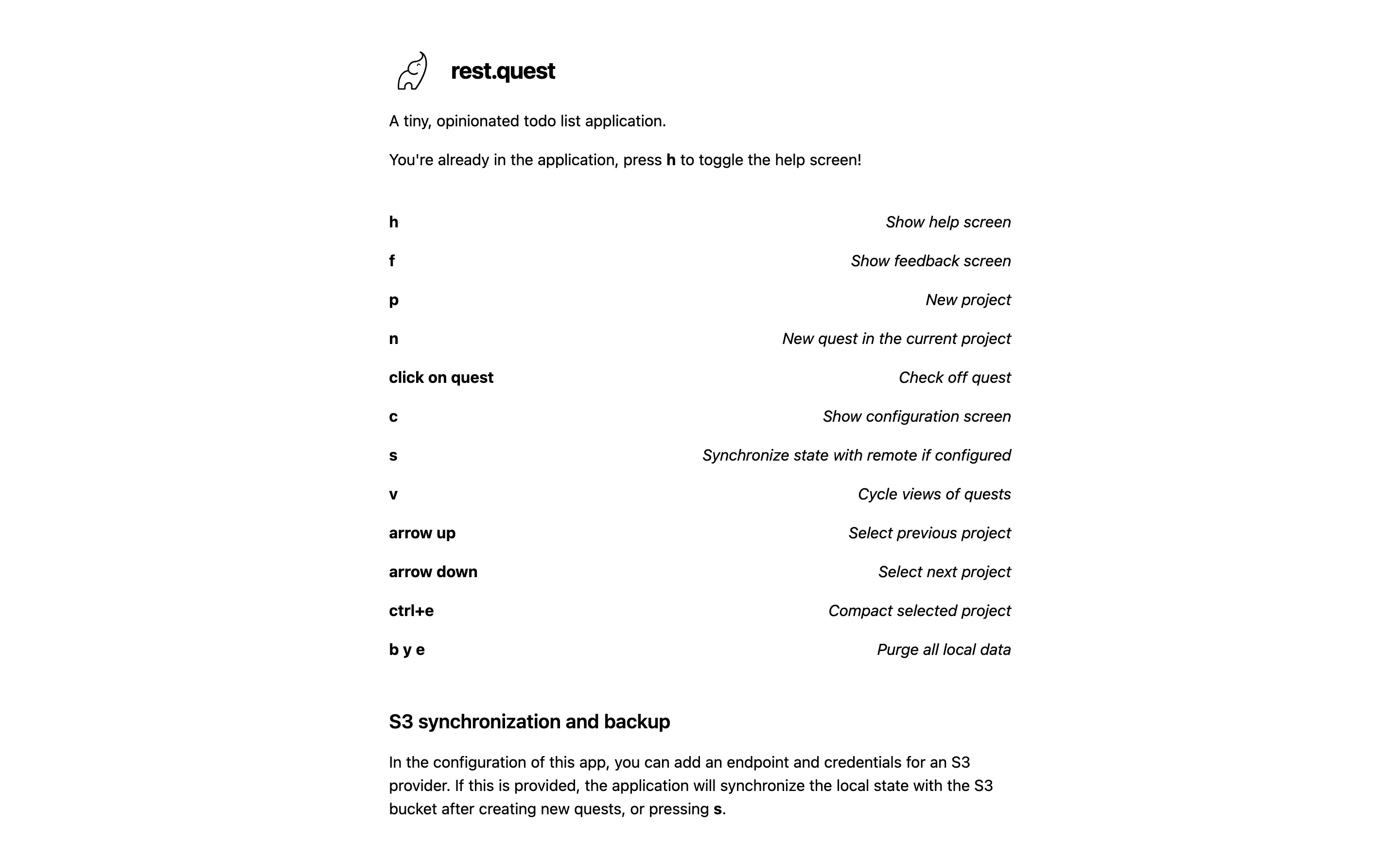
The landing page doubles as the help page, explaining all the shortcuts and the S3 sync feature.
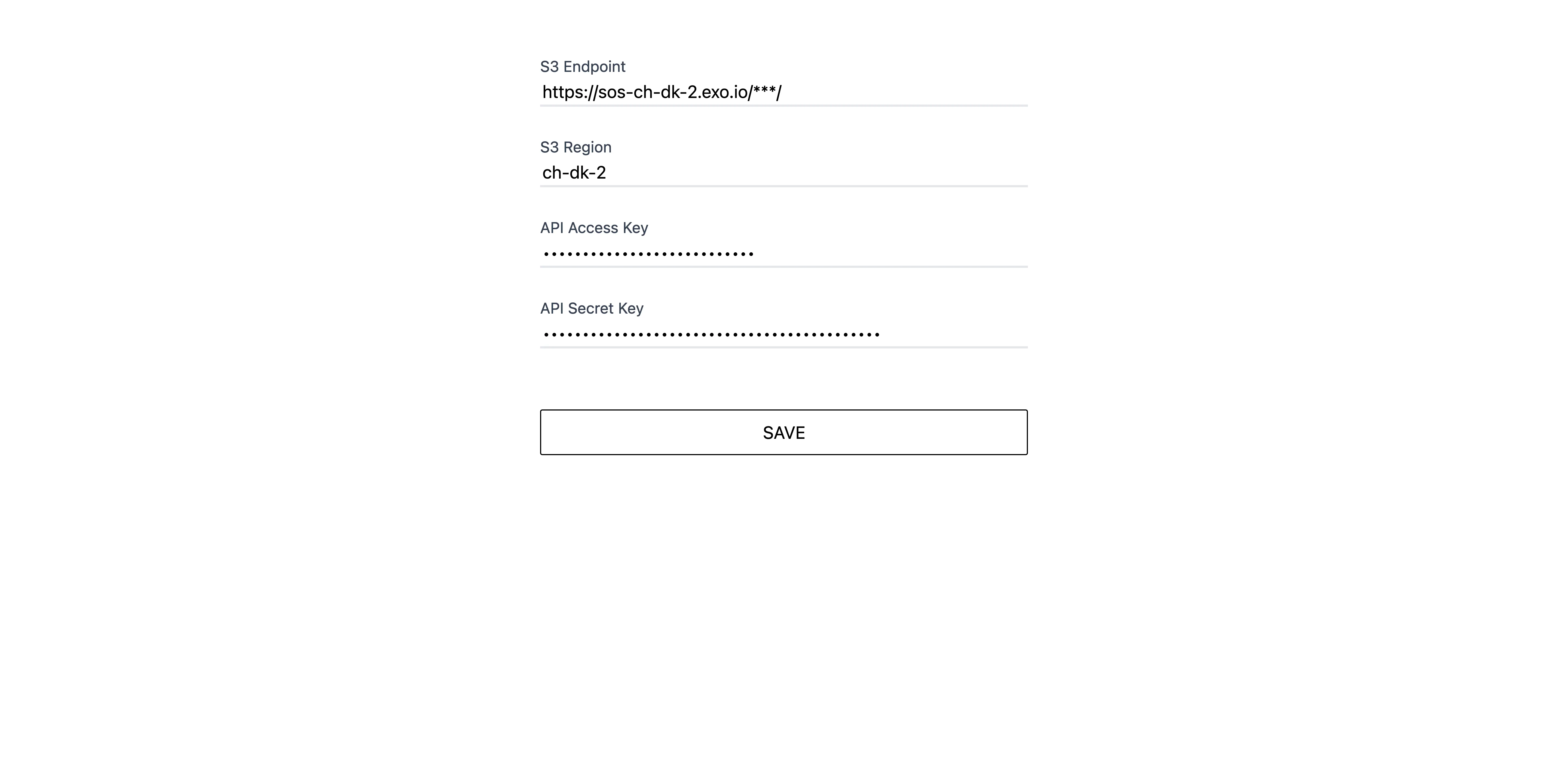
When S3 credentials are added to the configuration screen, the application will synchronize its state with the remote bucket. So by adding the same credentials to another instance of the app, say one on your private and one on your work machine, they will stay in sync. The credentials stay on your device in the browser’s local storage.
Process
First, I set up a schedule for this project:
- 2 hours for the initial technical setup and deployment
- 2 hours for the UI/UX concept (including feature set)
- 6 hours for the implementation of basic features
- 4 hours for the implementation of advanced features
- 2 hours of reserve
Notably, I set the schedule before I even knew what features I would want. The scope would have to fit the available time.
First, I set up a SolidJS (new to me at this point) project and deployed it to Github Pages (later, I would migrate it to my Hetzner VPS). Getting a “Hello world” version of a project deployed first is something I always do since that time a version of Fieldnotes didn’t even get deployed before it was obsoleted by the next version.
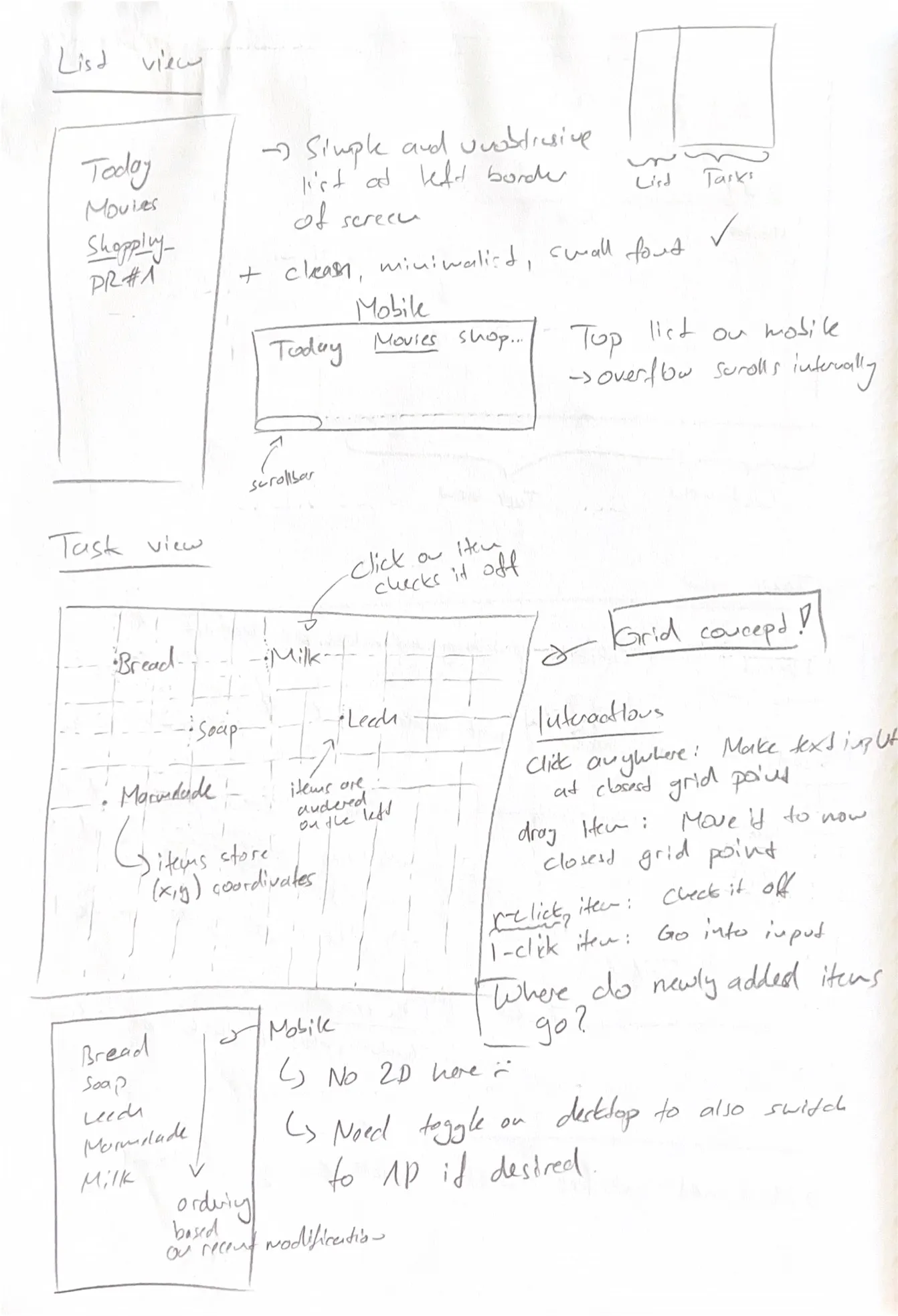
Next, I started aimlessly scribbling on a piece of paper about the feature set, how every UI element should look and behave, etc. Some features sketched out here made it into the app, others didn’t. In just about 2 hours, quite a few novel ideas came to mind that wouldn’t have, had I just started writing code from the start.
Full UX concept
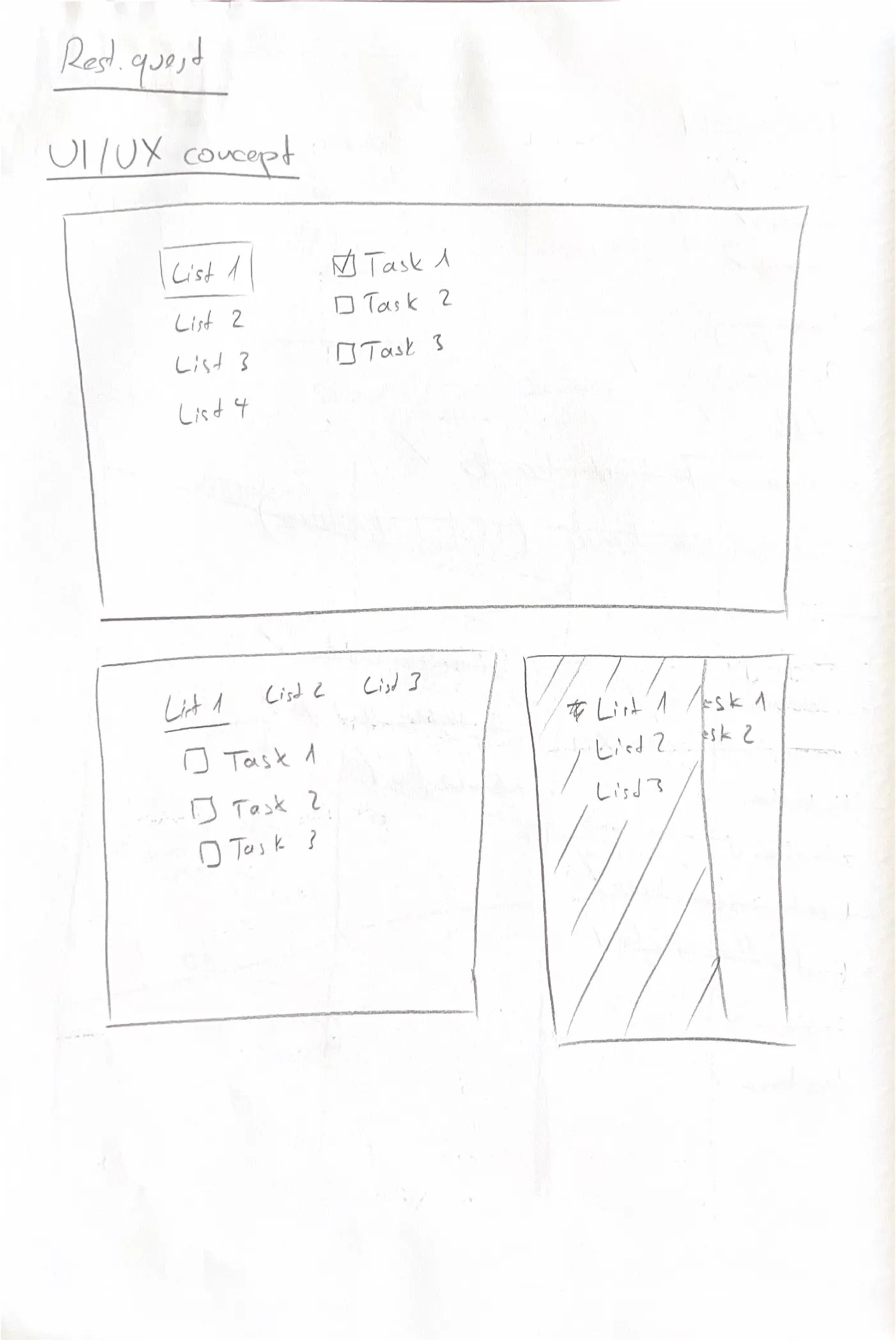
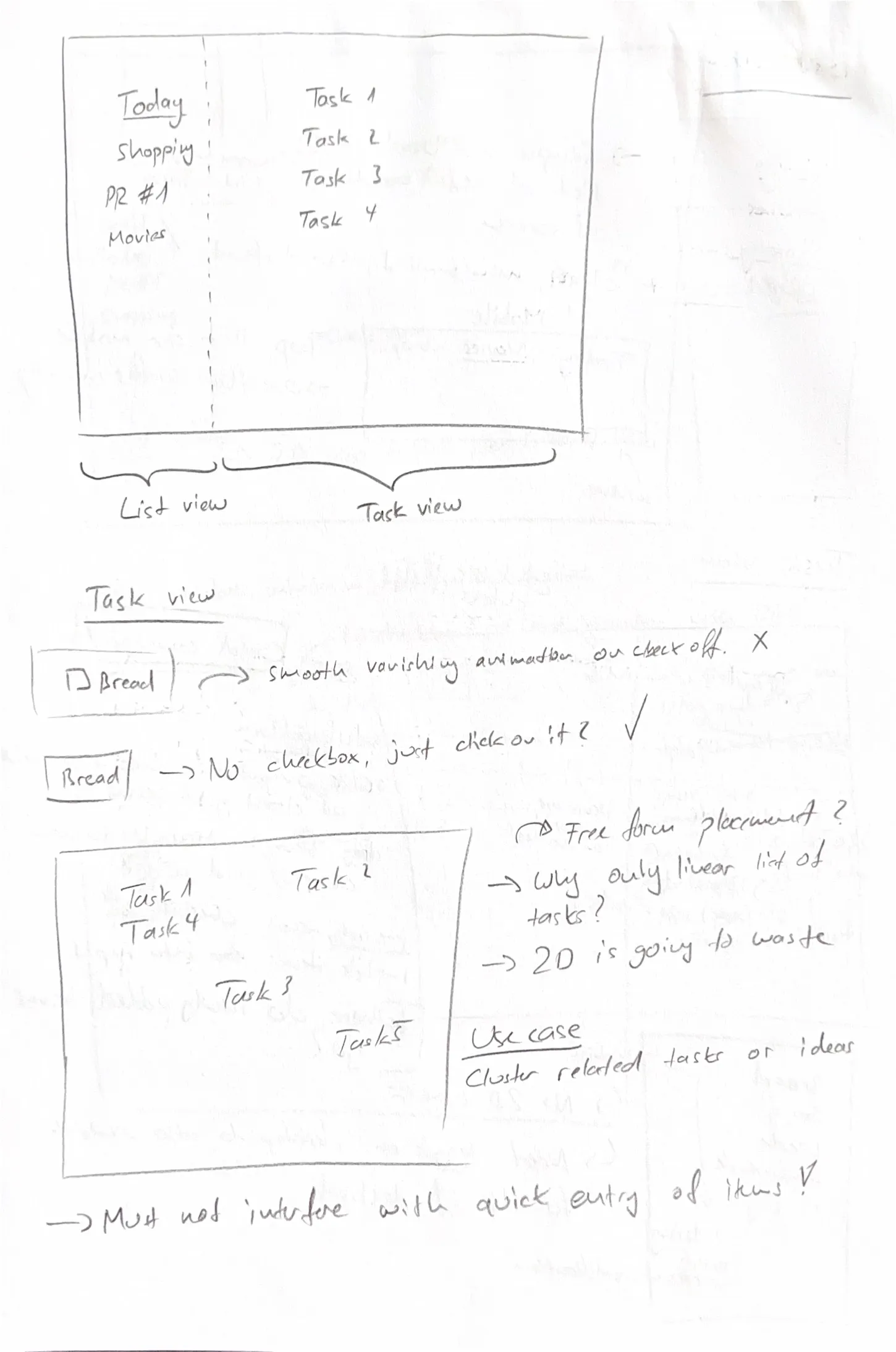

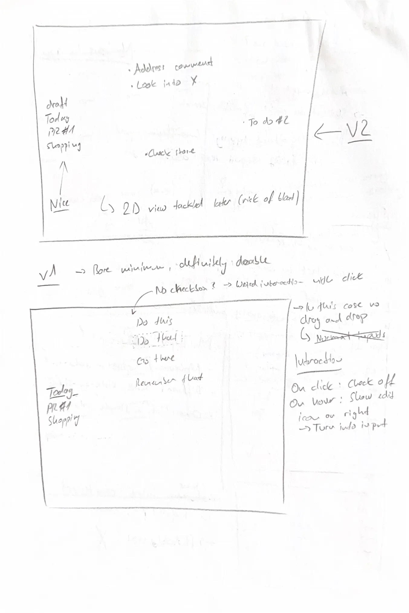
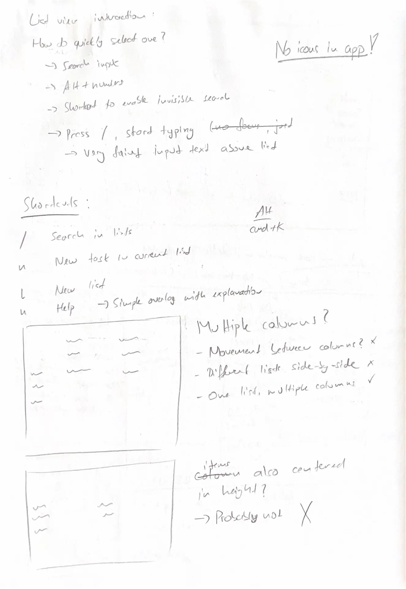
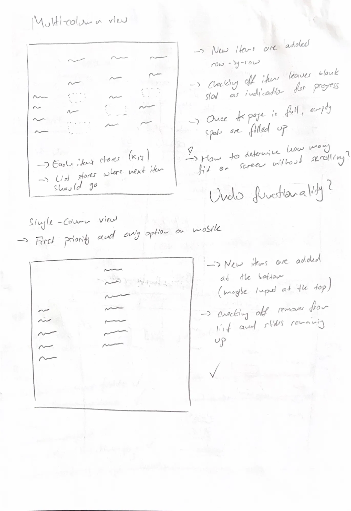
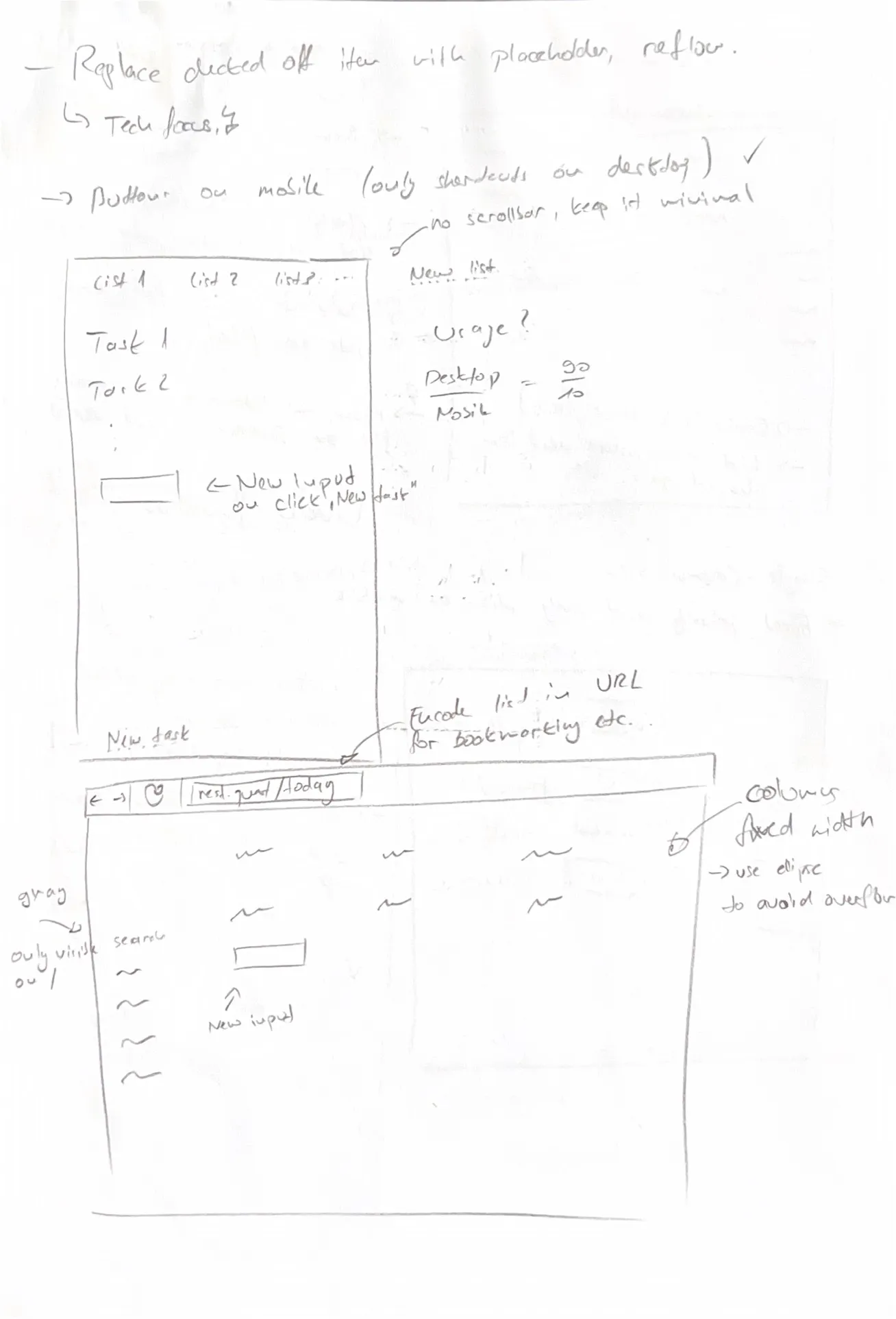
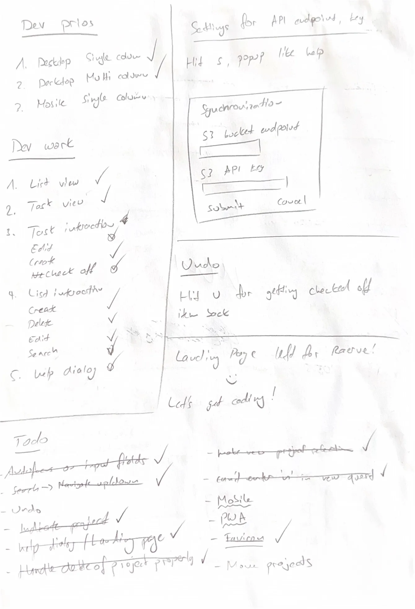
Finally, I actually built the application with a couple of hours of effort and a clear plan in mind. Still, stretching out this process over multiple evenings helps step back from tricky problems and overall improves the quality of the work.
Architecture
The application is frontend-only, originally as a consequence of the time constraint. As I started sketching out how this could work without a backend, I fell in love with the simplicity and elegance of this approach. The way I built it now comes with a number of advantages:
- Implementation effort is drastically lower
- The software is vastly more accessible as there is no sign-up
- Offline functionality comes practically for free
- The user gets to bring their own storage backend
There are disadvantages too, of course. This approach does not suit all applications:
- Non-technical users don’t know what an S3 bucket is
- Advanced features like sharing a list with a third party would be hard to pull off
- Less efficient synchronization (more data being sent and received)
One topic that is worth discussing a bit further is synchronization. In the original implementation described here, the application would only ever upload or download the full state in one big JSON file. To determine whether the local state or the remote state is newer, there was a separate version file in S3 that contained a version of the state (i.e., a simple number). Whenever a mutation happens on the state, like creating a new item, the webapp would increment the version. When synchronizing the state, it would first check the version of the remote state and compare it against the local version. If the remote version is newer, the app downloads the remote state and wholly replaces the local state. Otherwise, it uploads the local state.
This works for simple use cases: If this feature is only used to backup the state, it works fine. If you use the app on two devices, but only one at a time, it also works. If, however, two mutations happen simultaneously, one will be overwritten. Imagine the following scenario:
- State on devices A, B and S3 is in sync at version X
- User modifies state on device A (local state @ version X+1)
- User modifies state on device B (local state @ version X+1)
- User synchronizes state on device A against S3 (local state ahead, so S3 now @ version X+1)
- User synchronizes state on device B against S3 (local and remote state both @ version X+1)
At this point, the application either has to overwrite the local state with the remote state (losing modification on device B) or overwrite the state on S3 (losing modification on device A). Either is wrong. At the time, this was a risk I was willing to take in order to get this implemented quickly.
Some months (or years) later, I revisited this to make it a bit more robust. Now the application
treats each item and project as an entity with a unique id and modification timestamp. When
synchronizing the state, the application first downloads the remote state and then intelligently
merges the items from remote and local into a new state that is both stored locally as well as
uploaded to S3. This merging works by identifying matching items by id and comparing their
modification timestamps. The only situation where data can be lost now is if the same item is
modified on both devices before they sync with remote. For new items or other changes, the
application can merge the changes together without issue. The only non-trival case here is the
deletion of a project or item. How do you ensure that a locally deleted item doesn’t get added back
by the remote state? The answer is simply to maintain an object with a deletedAt property to
instruct the merging algorithm that the local state isn’t unaware of this item but has consciously
deleted it.
The keen reader will notice that there are more capabable (and thought-through) data structures to solve this problem, like CRDTs.
Learnings
The main revelation during this project was just how effective it is to spend more time than one would like brainstorming and conceptualizing an application. Many hours of coding were avoided by very carefully considering every aspect of a user interaction through to the end. In particular, the explorative quality of paper as a medium cannot be overstated. I occasionally get tempted by some tool like Figma for concept work, but I’m convinced nothing beats pen and paper for quickly jotting down ideas and exploring the plausibility of a design or interaction.
Another important lesson was the value of self-imposed constraints. Had I not set out to build this application in 16 hours, I’m certain I would have built a traditional backend with a database. The flexibility this brings would have led me down a path of building sharing and collaboration capabilities and many more features that wouldn’t have pulled their own weight. I also would have built a traditional UI to appeal to the average user.
Instead, having my hand forced by the time constraint, I built a more novel, minimalistic, and eccentric application. And I’m so here for it.